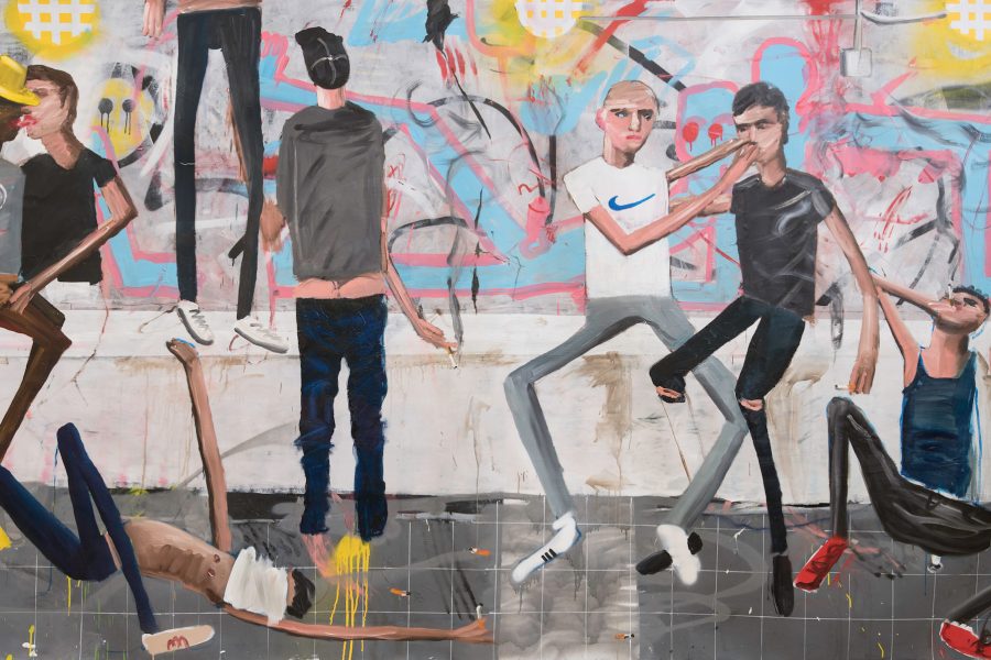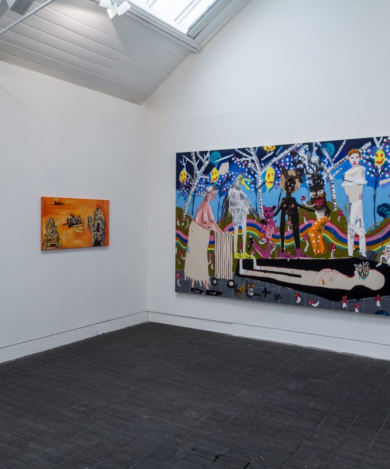
The Jerwood Painting Fellowships provide critical support for exceptional painters embarking on their professional careers. The third edition opened on 11 May (until 19 June 2016) exhibiting work by Fellows Francesca Blomfield, Archie Franks and Dale Lewis.
Francesca Blomfield’s work at Jerwood Space engages with visual information sourced from the world around her, either through everyday experience, or mediated through analogue or digital images. Limousines, wine glasses, ivy, moonlight, tagliatelle and human hair. Motivated by an ongoing interest in the limitation of painting as objects, Blomfield often extends tangential subject matters from her work by adding narrative dimensions – either through individual texts or creating publications. This blogpost is deliberately ruptured by words from the artist – from the works or from our conversation. Inspired by Blomfield’s use of systems, the intention is that it can be read in three ways – through the formal interview narrative, solely visually through images, or even just through these quotes.
Sometimes it can be easier to describe what is not there. This is not: an explanation of the paintings displayed, a guide to inform your opinions, a report […] an inclination to document my thoughts somehow in case they disappear and I can’t locate them again, a complete material history.
Philomena Epps: I wanted to start by asking you about your experience of the Fellowship, being mentored, and how your practice might have changed over the year?
Francesca Blomfield: The idea of having a mentor was a big draw for me when I was applying for the Fellowship. I saw who was on the panel [Phoebe Unwin, Dan Coombs and Jane Harris] and I really respect and admire all three artists. The prospect of having a relationship with one of them over the course of the year was really exciting. When I got the Fellowship, I was making really small work so having the financial security allowed me to experiment with scale and surface. I could use more paint. It was also good to have this focused period of time knowing that there was a show in the distance. Through carrying on and developing my practice, I discovered that I needed to find things to butt up against in my painting. Finding the opposition is integral to the way I work.
PE: You exhibited in a solo show at The Horse Hospital in November, which would have taken place during the middle of the Fellowship. Did that help shape the direction of the work on show here?
FB: I found out about it a month into the Fellowship so I was working towards that from early on. It was a solo show, which I had never done before. The Horse Hospital is not your typical white cube environment. I made a PVC banner to act as a screen. When I hung the show, I could hang it according to that banner. It was five metres long and three metres high, covered floor to ceiling, and cut off a quarter of the room. It created a sense of a new sort of environment, a space within the space, and forced me to arrange the work in a dynamic way that wasn’t simply practical. I normally make publications alongside the paintings. The banner was a one-off publication but not in a traditional page turning sense. I was interested to see what happened when I took a bit of a risk. It was important that the text itself didn’t explain the work, and it had a literal and poetic function within the space.
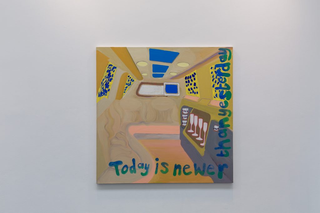
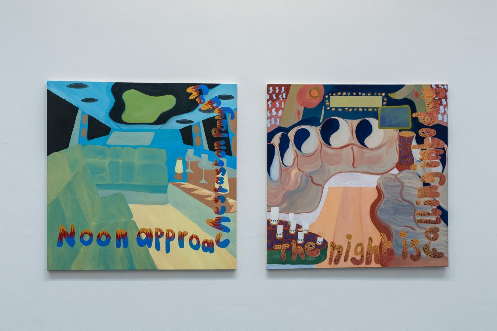
PE: There is an ongoing relationship throughout your work between text and paintings. Either through your incorporation of text into the works, like in the series of paintings of limousine interiors, or producing publications that function as an extension of the paintings, or the exhibition as a whole.
FB: I usually write alongside paint but this year the writing has taken more of a back foot. The banner I wrote for show at The Horse Hospital was quite an epic text. It was a lot of work to put into one piece. Normally when I write it isn’t as long as that, but I wanted it to read like an essay. I was interested in the idea of being presented with an intervention in the gallery and having to read something on that large format. It’s quite demanding – you don’t usually encounter that in an exhibition. I have been making text paintings for a while as well, often using found text and reformulating it as an artefact. I have used historical and specific advert texts, working from my collection of American magazines. I have pulp magazines and a stack of Flash Art from the 1980s. One of the paintings on show at The Horse Hospital was called Look For A Silver Lining. I repurposed a text from an advert from the American Bonds Agency. It was encouraging people to pay a portion of their paycheque into the saving bonds system, but the copy really drew you into another world, so I re-appropriated it for my painting. For the limousine paintings, I wrote the text myself. That’s one of the biggest changes that happened this year. In the past, that text would have been in a publication, and now it’s in the painting. It’s really exciting to be making the paintings like that now.
Of course, nothing can keep the dark skies away forever.
But if they should appear, remember,
Bonds can help you find the sunny side of life.
PE: Can you talk about the small numbered edition book of watercolour studies, Backgrounds, you have made for the Jerwood Painting Fellowships 2016?
FB: I made the watercolours as quick studies to find new patterns or ideas that I could feed back into the paintings. When I’m thinking through things I can’t work on my own. I have to be with something, and doing it, in order to go through a visible process. It wasn’t my immediate intention to make them into a book but I knew I wanted to make a publication. The title is due to the simple relationship that I have with the studies. The watercolours are literal backgrounds; they might not necessarily feed through to the paintings in a linear way, but they form the spine of the backgrounds that goes into the paintings. However, they are also objects in themselves. I was also thinking about the idea of the computer background where you have these pre-downloaded screensavers and ready-made prescribed images.
PE: Do computers or technology inform your visual language?
FB: Technology always interests me because it’s user-related. I’m interested in objects that people interact with, and commodified forms of information that people are always absorbing.
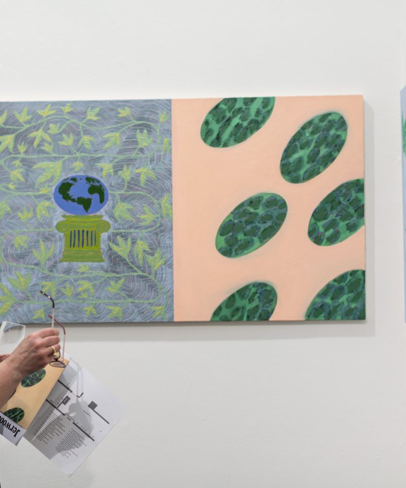
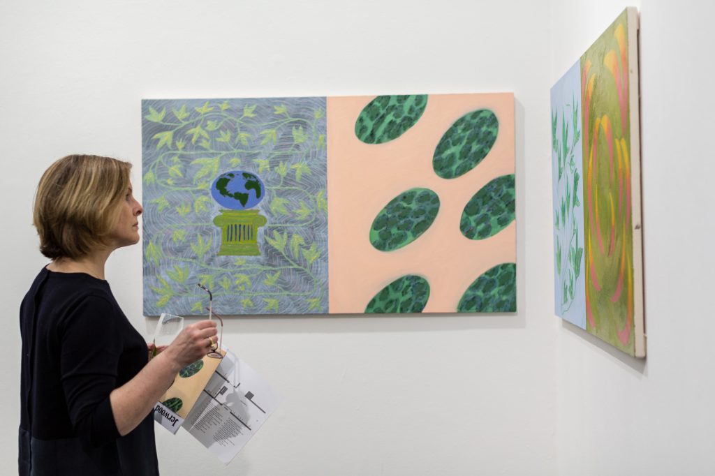
PE: The notion of ‘screens’ is also present in the two Split Screen paintings – Stretching Spheres and Ivy In Moonlight.
FB: I normally work with squares, and those two paintings are made from two squares forming a rectangle so it fits the bill. I am really drawn to screens, it always comes up. I think it’s the flatness. I was thinking about quite literal ways of presenting the screen through easily accessible subject matter, which made me think about the 48-inch flat-screen TV. At one point everyone had to have one, it was a really desirable object.
PE: Is there someone in particular that has inspired your way of writing or appropriating texts? Before we formally began this conversation we were talking about Kathy Acker.
FB: When I read Kathy Acker quite a lot of things clicked into place. I’ve always had the impulse to use other people’s writings. I like the idea of the copywriter as someone who uses other people’s voices, and how that way of writing is set to a system. I make paintings based on a certain number of limitations or systems that I create, or have to meet.
PE: What sort of limitations?
FB: Scale. Size. Dimension. I always paint in squares. The square has a modernist lineage. For me, it comes from the American Hard-edge painters; Frank Stella made a lot of squares. When I think about painting I’m always coming from the interplay of colour and form. I get really excited about that part of history and their pragmatic approach towards it. For me, painting is always the creation of a mood or an atmosphere. I developed that a lot more this year. With the paintings of hair and tagliatelle , which are made on twelve 26 x 26 centimetre canvases, I wanted to put in something that was an object, but also force it to become secondary. It’s more about the system that it exists in, and how I am making decisions within that. I had never stuck so strictly to the guidelines that I’d set myself before I made that work.
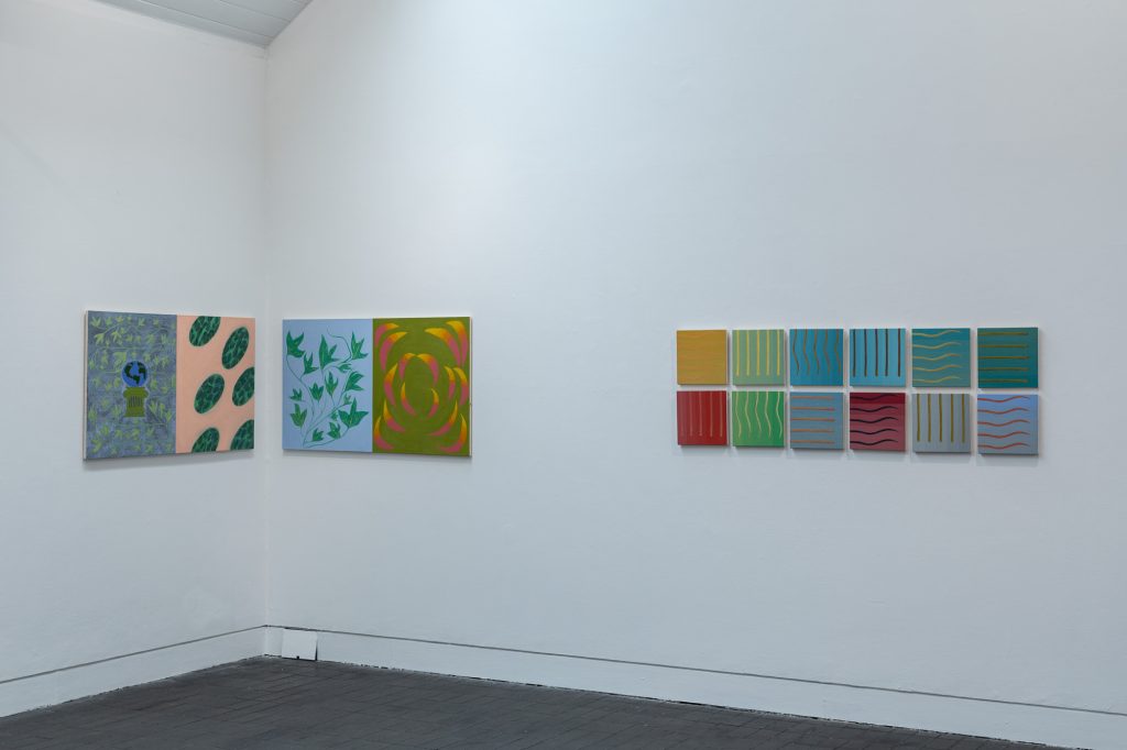
PE: There is also an individual relationship between the hair and tagliatelle themselves, they have the same formal shape but are completely different objects. They belong to the same system but have opposing material qualities.
FB: Exactly. Choosing those two things was quite irreverent too, maybe arbitrary. The pasta resonated with me because it’s so generalised. Everyone eats pasta, it’s quick and it’s easy. It has softness and a domesticity to it. The subject matter in the other paintings often has that same feeling of arbitrariness or banality. That’s something that is quite present for me at the moment, and has been for some time.
The night is falling into day. Today is newer than yesterday.
Noon approaches fast on payday.
PE: With the limousine paintings, complete with a rack of wine glasses and starlit windowpanes, a faux-luxury environment is established. However, the use of colour, specifically the chalky yellow in Anticipation Grows For Her Birthday, washes out any expectation of glamour, or subverts it somehow.
FB: When I’m dealing with subject matter, it drives all the other issues – colour, structure and form. When I was working on the paintings of limousines, which is a repetition of the same object in three different ways, I was very conscious about what the other issues [colour, structure and form] said about the subject itself. I agree with faux-luxury. It’s very derivative. Not everyone can go in a limousine, or wants to go in one. It’s a cliché of glamour. There is a slight vein of criticality but because I’ve repeated them in such a way I hope that they stand as paintings on their own without that. It’s about balance. Colour is very powerful. It creates situations or ways for the spectator to read the form in certain ways. The flatness of the paintings is very important for that too. They have an abstracted quality to them, almost like a fold out shape.
PE: Can we talk a little more about your palette? It’s very consistent throughout the show.
FB: When I started making this set of paintings, just after I had finished the body of work that was in my solo show at The Horse Hospital, I was looking at my use of colour. I was talking to Phoebe [Unwin] about it. Her take on colour is really interesting, particularly how it operates in her own work. She spoke about colour consistency and how you can create and play around with tone. With this show, I wanted to implement a sense of difference but retain a certain light that was consistent. I’ve been applying a chalky and material use of paint. When I was mixing colours I was dealing with the systems of colour-making; creating tonal palettes based on what I wanted each painting to be. I came up with the titles when I was painting; it was quite a quick process. I had to come up with the ideas quickly as it was a two-day drying time and I wanted the text to be incorporated. The title needed to be made in the process of making them, so all the sections – form and subject – all fitted in together.
PE: Were you working from a particular physical image of a limousine or from an idea of one in your head?
FB: Initially I wanted to do it straight from my head but I realised there were certain things that I just couldn’t miss out. All the paintings have the same elements and that was really important, so that the register of a limousine is still always present. I could take it too far and then you wouldn’t be able to recognise it immediately. I did some research on the Internet. I didn’t want it to be about the experience of being in a limousine, more about the subject that surrounds it. I took lots of pictures and put them together, working from them in the sense that certain parts were always in there. There is still an element of improvisation though, so that they have their own different qualities.
PE: I think it’s interesting that there is no one inside them too, it’s all implied. As a result, the viewer is more likely to impose him or herself into the environment.
FB: It’s the notion of image making. An image stands for a lot more than its formal parts. All those associations and registers come into play. They’re unavoidable and I don’t want to get rid of them. Even though they can be quite difficult sometimes… but I like the difficulty, and the contradiction, and the grey area of what the register of the image is.
When I think about painting’s history, it’s always about overcoming oppositions or contradictions.
PE: I really like the titles, particularly how they tell the same ‘story’, but in a different form.
FB: That was really important, that they say the same thing in different ways. All the sentences end in ‘day’, which is another set of systems. I’ve got two limitations – all the text has to fit on the painting and go up the side of the canvas, and that it has to end in ‘day’. It might be arbitrary but you have to consider how far you can take things in order to fit those constraints, on a linguistic level or a textual level. The constraints are part of it. I want to keep developing in certain ways.
PE: What do you think about current painting? Is there someone in particular you’re inspired by at the moment?
FB: I really like Jana Euler’s work. It’s very conceptual. I’m always drawn into that way of thinking about things, even though my practice is immersed in the physicality of painting. I have to make the paintings in order to solve the issues, make the mistakes and have the failures. There is something about her approach that is really dynamic and forward-looking. I find it quite brave. She’s not scared of style, or having a house style, she actually utilises it in order to turn it back on itself and to consider what painting actually does.
PE: I’m intrigued by what you just said about failure. Are failures productive in painting?
FB: They’re really necessary. I think they’re a must. I watched a great video of Philip Guston recently that my friend told me about. He’s being interviewed while he is painting, and he suddenly just chucks it in the bin. It’s a pretty good painting – it’s Philip Guston! He just throws it away. The interviewer asks him about it and he says ‘it’s not right it’s too good’. I’ve spoken to Phoebe a lot about ‘the hunch’, and what that is and what it’s about. When you’re in the studio you have to go through it. I have to do it. I have to fail in order to find the solution. For every painting that I would show someone there are a hell of a lot of failed paintings. My work isn’t necessarily all about failure, but it’s there. For every painter it’s there.
It feels strange talking about my work out here while seeing it through the window in the gallery space. It’s like a long-lost family member.
PE: What’s next after the Jerwood Painting Fellowships 2016 exhibition at Jerwood Space closes next month?
FB: I’m part of a group show in July at Transition Gallery in London called Miami Vice with Jennifer Campbell and Grant Foster, both painters. The approach to the exhibition considers the cinematic colour palette that is brought to mind when people think about Miami. Bleached and chalky, quite similar to the colours I’ve been using. I’ll be including some recent text paintings and more hair and tagliatelle ones, as that is actually an even bigger series than the twelve exhibited here. There are also some paintings that didn’t go into the show, which are extracts from the limousine ones. The extract is quite a literary thing, so there is a crossover there, which I want to expand on and explore further. I also just want to carry on making work. The Jerwood Painting Fellowships 2016 show really embodies the last year of working for me, but there is a lot more to carry on with!